How to Choose Colourful Wall Prints for Your Home Decor?
Choosing Colourful Wall Prints for your home can be a rewarding yet daunting task. These prints inject life into your space. They can reflect your personality and style. Different colors evoke various emotions. For example, bold reds and yellows energize a room. Softer blues and greens create a calming atmosphere.
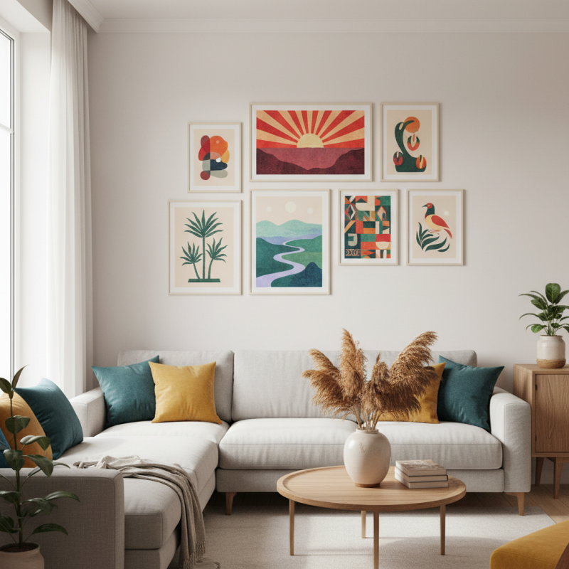
When picking colourful wall prints, consider your existing decor. The prints should enhance, not overwhelm your space. Think about balance. A large, vibrant piece may dominate a small room. In contrast, a series of smaller prints can create a dynamic gallery wall.
Reflect on your preferences and lifestyle. Do you prefer abstract art or nature scenes? Finding the right prints may take time and thought. Visit local galleries or browse online to explore options. Pay attention to the size and frame of each piece. Ultimately, the goal is to create a cohesive and inviting space with meaningful expressive prints.
How to Identify the Right Color Palette for Wall Prints in Your Space
Choosing the right color palette for wall prints can transform a space entirely. According to a report by the Color Marketing Group, 90% of purchasing decisions are influenced by color. This emphasizes the need to select prints that resonate with your room’s overall vibe. Start by observing your existing decor. Identify dominant colors in furniture, flooring, and textiles to create a cohesive look.
When selecting wall prints, think about the emotions colors evoke. Warm tones create energy, while cool shades evoke calm. A study published in the Journal of Environmental Psychology suggests that color can affect mood and productivity. Consider how you want to feel in each room. For example, soothing blues may be ideal for a bedroom, while vibrant yellows can inspire creativity in a home office.
It’s important to test colors in your space. Paint swatches on the wall next to your prints before committing. Natural light changes color perception, so assess them at different times of the day. Sometimes, colors you thought would work may clash with existing decor or look dull in varying light conditions. This exploration can lead you to unexpected combinations that truly elevate your home.
Understanding the Psychological Effects of Color in Home Decor Choices
Color plays a vital role in our daily lives. Choosing wall prints with the right colors can influence your mood significantly. For example, warm colors like red and orange can evoke feelings of excitement and energy. These shades often stimulate conversation and activity, making them ideal for social spaces.
On the other hand, cooler colors such as blue and green can create a sense of calm and relaxation. They work well in bedrooms or meditation areas, fostering a serene environment. However, relying solely on your favorite colors might lead to unexpected results. Sometimes, a beloved hue can create overwhelming emotions or make a space feel smaller.
It's essential to consider the overall harmony of colors in your home. Look at the light in the room at different times of the day. You might find that certain colors appear harsh or dull in certain lighting. Finally, don't be afraid to experiment with a variety of prints and shades. Reflect on what feelings they evoke in you, and trust your instincts. Your home should reflect your personality and make you feel at ease.
Evaluating Different Art Styles for Vibrant and Cohesive Home Themes
Choosing wall prints can be overwhelming. Different art styles evoke various feelings and suit diverse themes. A vibrant piece can energize a room, while calmer tones can create a relaxing atmosphere. Consider how each print complements your existing decor. Will it clash or create harmony? Evaluating the emotional impact of colors is essential.
Tips for selecting the right wall prints: Choose prints that resonate with your personality. Abstract art can add a modern touch but may lack warmth. On the other hand, botanical prints bring nature indoors. They often create a cozy environment. Look for artworks that stimulate conversation and reflect your taste. Sometimes, an impulsive choice can bring unexpected delight.
Remember to balance bold colors with neutral items. A bright print can dominate a room, while subtle pieces enhance its charm. Mix styles but maintain cohesion. An eclectic gallery wall might appear chaotic if not curated carefully. Reflect on what elements tie your prints together. Colors, frames, and themes should resonate with one another to achieve visual consistency.
Tips for Harmonizing Wall Prints with Existing Interior Design Elements
Choosing colorful wall prints can greatly enhance your home decor, but it requires careful consideration. Research indicates that about 62% of homeowners regard wall art as a crucial design element. This means you need to harmonize your prints with your existing interior elements, such as furniture, color schemes, and lighting. Opting for prints that complement these factors creates a cohesive look. For instance, if your space features earthy tones, vibrant artwork with similar hues can uplift the area without overwhelming it.
When selecting prints, consider scale and placement. Large prints can make a bold statement but may seem out of place in smaller rooms. Conversely, a series of smaller prints can enhance visual interest in a gallery wall. A study found that well-placed art can improve mood and increase feelings of comfort at home. This highlights the importance of thoughtful design decisions. However, don’t shy away from creating contrast; a striking piece against a neutral wall adds depth and intrigue. Reflect on how different prints evoke diverse emotions, and choose pieces that resonate with your personal style while fitting into the overall aesthetic of your home.
Choosing Colourful Wall Prints for Your Home Decor
This bar chart illustrates the preferred color schemes for wall prints among different interior design styles. It helps you understand which colors harmonize best with specific decors, aiding in your selection process.
Selecting Quality Materials and Finishes for Lasting Wall Print Appeal
When selecting wall prints, quality materials are crucial. A well-made print not only looks better but lasts longer. Look for prints on acid-free paper. Such prints resist fading and yellowing over time. Canvas is another excellent option. It adds texture and depth to your decor. Ensure the fabric is treated to withstand environmental factors.
Colors matter significantly in wall prints. Vibrant hues can enhance a room's mood. But consider how colors interact with existing decor. Test prints against your walls before finalizing your choice. Use samples to see how different lighting affects them. This is often overlooked but essential for achieving the desired atmosphere.
**Tip:** Regularly check the condition of your prints. Dust can accumulate, dulling their appeal. Carefully clean them without damaging the surface. This simple step extends their lifespan and vibrancy. Remember, even high-quality pieces require some maintenance. Reflect on your choices and adjust as needed.
How to Choose Colourful Wall Prints for Your Home Decor?
| Aspect | Recommendation | Material | Finish |
| Colour Scheme | Choose complementary colours to your existing decor. | Canvas | Matte |
| Print Size | Consider the wall space and room proportions. | Acrylic | Gloss |
| Theme | Select a theme that reflects your personal style. | Metal | Satin |
| Framing | Use a frame that complements the print and decor. | Wood | Natural Finish |
| Lighting | Ensure there is adequate lighting to highlight the prints. | Paper | Textured |